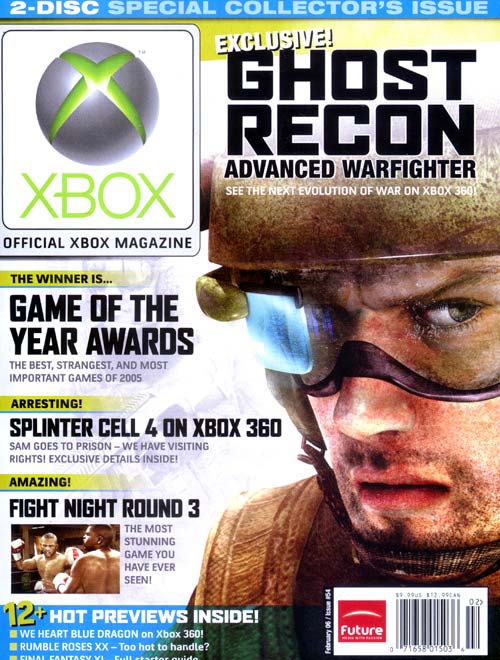
 Module 1 Preperation: The Xbox symbol is very large on scale of the magazine cover, reinforcing the importance of it being the official Xbox magazine, giving it a form of exclusivity or classification making it stand out and be better than the rest. The bold, black capital letters spelling out Ghost Recon a new long awaited game on Xbox has been made the main attraction, placed at the top of the page next to the Xbox symbol. The computer image of a soldier is the main image on the page, it is attracting to the reader as the computer made soldier looks so realistic, highlighting the great graphics of Xbox as their unique selling point. This technique is also repeated in the other image on th page, of a boxing match which is so fascinating it actually looks real. The extra at the bottom of the page says '12 hot previews inside!' once again attracting the reader. The images on the cover are of stereotypically strong, true men, the soldier and boxers help to promote the patriarchal society associated with the technological industry, resulting in the audience most probably being young males who are heavily interested in spending time on computer games of a high standard, as the Xbox 360 is very expensive and games are very expensive, i expect the magazine to also be expensive.
posted by ashmed6 at 10:42 AM
![]()

0 Comments:
Post a Comment
<< Home