Module 1 Preperation: The Xbox symbol is very large on scale of the magazine cover, reinforcing the importance of it being the official Xbox magazine, giving it a form of exclusivity or classification making it stand out and be better than the rest. The bold, black capital letters spelling out Ghost Recon a new long awaited game on Xbox has been made the main attraction, placed at the top of the page next to the Xbox symbol. The computer image of a soldier is the main image on the page, it is attracting to the reader as the computer made soldier looks so realistic, highlighting the great graphics of Xbox as their unique selling point. This technique is also repeated in the other image on th page, of a boxing match which is so fascinating it actually looks real. The extra at the bottom of the page says '12 hot previews inside!' once again attracting the reader. The images on the cover are of stereotypically strong, true men, the soldier and boxers help to promote the patriarchal society associated with the technological industry, resulting in the audience most probably being young males who are heavily interested in spending time on computer games of a high standard, as the Xbox 360 is very expensive and games are very expensive, i expect the magazine to also be expensive.
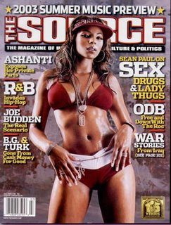 Module 1 Preperation: Big, bold masthead that's eye catching, however it is being slighty covered by Ashanti which suggests the major success and credability of 'The Source' magazine that people know of it without having to see the whole name also showing how big 'The Source' is as an institution. Central to the magazine cover is a mdeium long shot of R & B star Ashanti who is posed in a seductive position in a bikini, the magazine is playing on the fact that it's readership is mainly males and using sex to sell, however reinforcing the patriarchal society of women conforming to Mulvey's male gaze theory. The word sex is part of the most eye catching pug as it is in bold, capital letters once again trying to attract the male readers. Big name musicians are also used to sell the magazine; Sean Paul, ODB, Joe Budden and Ashanti clearly showing this is a music magazine are all names 'dropped' onto the front cover to give a 'sneak peak' into what the magazine consists of. Representation of ethnic minorities is predominant as only one image is on the front cover and that is of a black woman, however this is suited as the magazine is devoted to R & B and Hip Hop. The magazine also uses more teasers to persuade readers to buy the magazine by stating that it has the '2003 music preview' at the top of the page just above the masthead, attention is drawn to the exclusivity of the magazine. The audience for this magazine is probably young, black males as their interests will are Hip Hop music and the beautiful women associated with it.
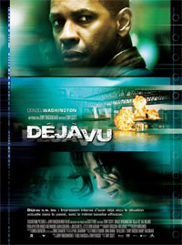
 Module 1 Preperation: Good representation of ethnic minorities, black male dominates poster and the only other character on the screen is hispanic woman, could show that in society both men and women are equal rejecting patriarchal ideologies within the movie. Denzel washington is seen a close up shot looking directly at the audience, this engages with the reader and catches their attention. The fusion of many different aqua style colour gives a very modern feel to the poster and the film its promoting. The text spelling the name of the film is central in the poster highlighting its importance however the picture of protaganist Denzel Washington is bigger then the text suggesting he is 'selling' the film. The eroded style lettering combined with the explosion in the main image, suggests the film is action or sci-fi genre. The contrast of the orange coloured explosion and the water coloured background is very eye catching and is also a technique that attracts the reader. Cant quite see the instiution but you can imagine that it is a big hollywood institution with a large budget due to the special effects that can be seen and the A list actor, Denzel Washington.
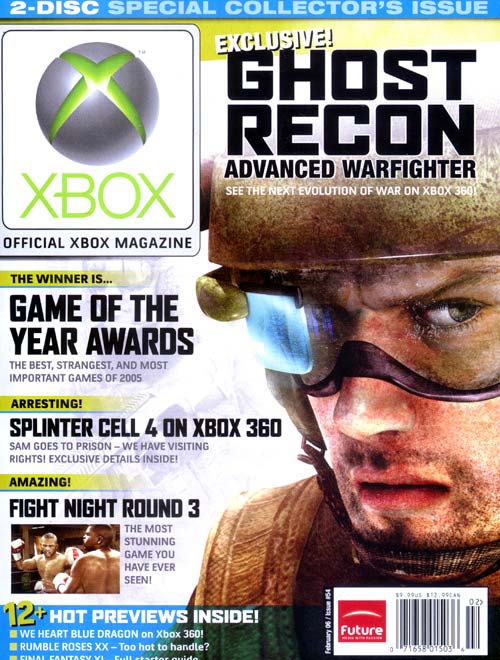 Module 1 Preperation: The Xbox symbol is very large on scale of the magazine cover, reinforcing the importance of it being the official Xbox magazine, giving it a form of exclusivity or classification making it stand out and be better than the rest. The bold, black capital letters spelling out Ghost Recon a new long awaited game on Xbox has been made the main attraction, placed at the top of the page next to the Xbox symbol. The computer image of a soldier is the main image on the page, it is attracting to the reader as the computer made soldier looks so realistic, highlighting the great graphics of Xbox as their unique selling point. This technique is also repeated in the other image on th page, of a boxing match which is so fascinating it actually looks real. The extra at the bottom of the page says '12 hot previews inside!' once again attracting the reader. The images on the cover are of stereotypically strong, true men, the soldier and boxers help to promote the patriarchal society associated with the technological industry, resulting in the audience most probably being young males who are heavily interested in spending time on computer games of a high standard, as the Xbox 360 is very expensive and games are very expensive, i expect the magazine to also be expensive.